Stabilized
Steps.
A digital exercise experience alongside a mobility aid, designed for older adults working on balance and fall prevention.
The exercise happens beyond the screen.
Stabilized Steps was developing a mobility aid and a companion therapy experience to help older adults build balance and mobility. The digital product had to help someone get started, understand an exercise, and record what they did—while they might also be using a chair or balance aid in the room.
From January–June 2021, I worked on the product as one of three designers. I personally audited competing apps, interviewed current and potential users, and facilitated a brainstorming session. Our team synthesized research, mapped the first-use journey, developed wireframes and a mid-fidelity prototype, and tested it.
Respect mattered as much as reassurance.
I interviewed people in the product’s 65+ target group as part of ten remote interviews and concept tests. We compared the existing experience with a competitor and organized patterns through affinity and empathy mapping.
Technology did not always feel as intuitive to participants as the team expected.
A clinical look felt cold and sterile.
Overly friendly alternatives could feel patronizing.
The design challenge was to make support clear and approachable without talking down to the person using it.
Four moments to make easier.
Our first-use flow moved from sign-up and assessment to a first class and a post-exercise log. The team used sketches and wireframes to make each step more legible, with particular attention to type size, contrast, icon meaning, labels, and straightforward language.
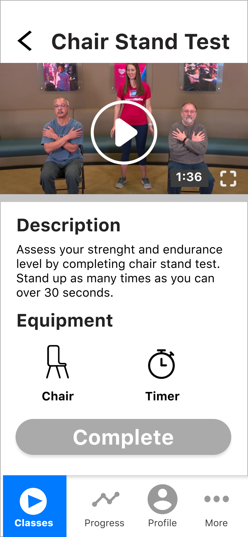
The class screen put the video, duration, description, and equipment in one place. Those details matter when the user is preparing to move in the physical world, not simply tapping through an app.
The prototype made its blind spots visible.
We tested the mid-fidelity prototype in person with five people aged 65 or older, using a laptop. They worked through sign-up, assessment, the class screen, and the post-class log while we observed where the language, navigation, and controls caused confusion.
Finding 01 The class list did not clearly communicate a daily structure. “See All” was easy to miss, and “More” was ambiguous.
Finding 02 On the class screen, people had trouble interpreting the video expand and minimize icons and the wording of “Complete.”
These were findings from the tested iteration, not a claim that the problems had already been resolved.
Clarity is also a form of respect.
This project taught me to look beyond whether a screen is technically usable. Tone can affect dignity. A small or ambiguous control can interrupt an exercise. And the interface has to account for the chair, walker, and physical effort outside its frame.
My contribution was part of a three-designer team, and the work shown here reached a tested mid-fidelity prototype.
Next project: ADI